Mondus is a pre-seed startup with a huge mission to fix the way money is lent to people to buy their own homes. They had a very clear mission and set of foundations to build a great brand from - we worked with them to build a solid start for the visual part of that brand with room to grow with the company

A strong narrative was built around the circle which comes from the modus name. We leaned into this idea of the circle building it into the logo itself and created a custom font, again using the circle from which each letter grew out of to be come a foundational building block.

They wanted the ability to have an icon that can sit with the logo or on its own, so we came up with the concept of the lift icon. Mondus stands for helping people and giving them a lift up to own their own home so with addition of this foundational element, we give the logo a sense of elevation which aligns to the mission.


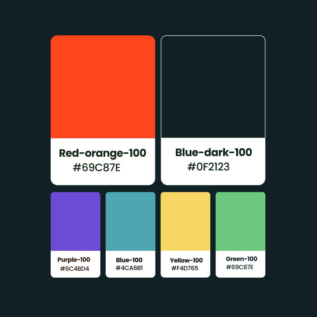
We created templates for using across digital and print, again using the lift icon and underline element always supporting the message. Imagery was explored along with different colour themes. We wanted to give enough to get them going but not lock the brand in with too any rules so it can grow with the product.

An initial v1 website template was created to get things started but again this will evolve as needed.


